Codicology
The pages of the Bryn Mawr College processional are made of parchment, which is animal hide that has been chemically treated, scraped, and stretched.[1] The most expensive parchments were painstakingly worked so that each sheet was thin and soft, with a smooth, even finish, but the processional uses relatively thick sheets that have occasional imperfections like small tears and discolorations.[2] Its pages are made of large sheets of parchment that were usually folded into booklets called quires or gatherings and sewn together at the inner crease. Each quire was copied separately, before the different sections of the book were bound into a single volume, or codex. The quires were often organized with the help of catchwords, which are short phrases written at the end of each one that anticipate the first words of the next one (for example, “hoc pane,” on f. 79v).[3]
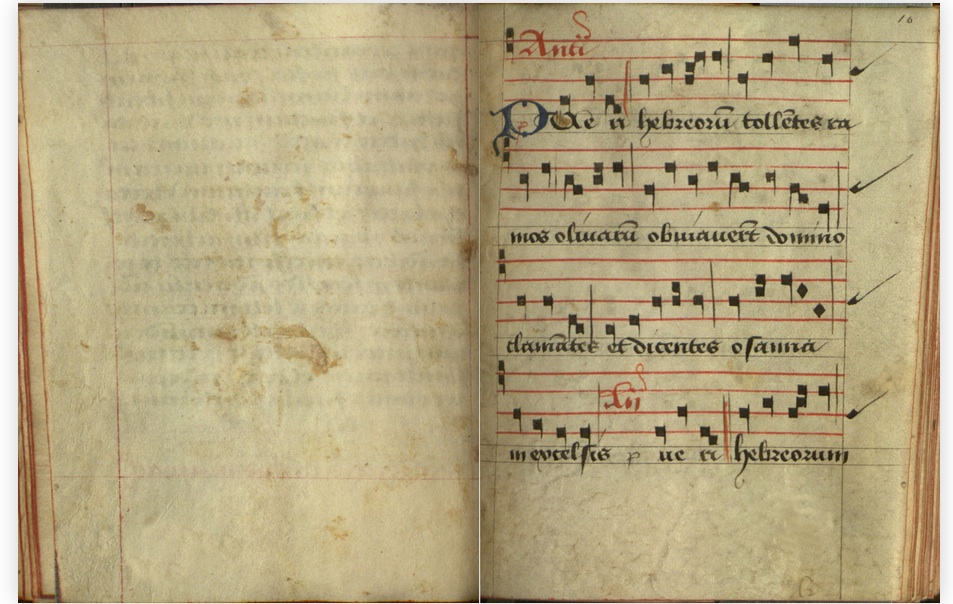
Red margin lines on blank and filled pages. Poissy Processional, Bryn Mawr College, ff. 9v-10r
Each sheet of parchment in a sewn quire is called a leaf or bifolio, one half of which is called a folio (abbreviated f. or ff. in plural). The side of the folio that faces the front of the book is called the recto, and side that faces the back is called the verso. Before the folios could be filled, they were lined in ink, which helped to organize the manuscript’s texts, music, and decorations. Our manuscript uses red ink, which was fashionable in the Gothic period.[4] On the recto of first folio of each quire, the designer drew lines on all four sides and then pricked them through at the edges with a tool sharp enough to go through the whole quire, so that each folio in the quire would have equally spaced margins. More red lines were added to enclose the texts and to make musical staves. The words that accompany the music were written within black lines.

The rubric “In egressu processionis,” from the Palm Sunday service, indicates that the following chant was sung as the choral procession exited the nave. Poissy processional, Bryn Mawr College, f. 11v
Once the pages were lined, the scribes could begin copying the words onto the parchment. Many of the Poissy manuscripts seem to have been produced outside the convent, probably in Paris, but there is a chance that the women of Poissy copied some of them. The Bryn Mawr College processional is written almost entirely in Latin, although it includes a brief note in French (f. 102r). Inconsistencies in the hand indicate that it may have been the work of several scribes, although it is written throughout in a clear if not especially precise Gothic script that uses a number of conventional abbreviations.[5] For instance, when the letters ‘n’ and ‘m’ follow a vowel, they are often omitted and replaced by a curved accent over the vowel. Regular Latin endings are often replaced by marks of abbreviation, common words are occasionally replaced entirely, and holy names are frequently abbreviated out of respect. (If you are new to medieval paleography, it may be fun to transcribe a bit of the text and check your transcription against the one provided!)
The processional is not illustrated, but it includes a number of decorated initials, which mark important divisions in the prayers. It is clear that the largest of these were added after the main texts, perhaps by a specialized artisan, because we can still see that small, light letters were made within gaps in the texts indicate where larger initials were supposed to be placed. Several of these guide letters remain inside the initials (as in the blue initial for “Omnipotens” on f. 7v) or mark places where initials clearly were intended but never drawn (as in “pueri” on the last line of f. 10r).
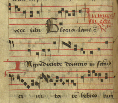
The black initial for “Gloria…” indicates a repeat of the chant beginning with the same word on 18r-v. The red initial for “Ingrediente” indicates the start of a new chant. Poissy processional, Bryn Mawr College, f. 19v
The recto of each folio is now numbered at the upper right in a later hand, but modern pagination would have been foreign to a medieval reader, who would rather have looked for cues in the color, size, and decoration of letters. For instance, instructional passages called rubrics, written in red ink, name each prayer and describe aspects of the service. Large, alternating red and blue initials indicate the beginnings of services, while smaller ones mark divisions within prayers (see, ff. 52v-53r). Further divisions are indicated by a light wash of yellow ink across the first letter of a word. Although each chant begins with a larger red or blue letter, decorated black initials mark important verbal and musical division, like the shift from verse to antiphon. They can also indicate musical passages that are elided or repeated from earlier in the text. Although these marks may look decorative, they were essential performance aids that made it easier for users to locate passages and to recognize important distinctions in the manuscript’s contents as they read or sang its prayers in church.
The manuscript’s use of punctuation is also tied to performance. Although some of the punctuation marks may look familiar, they do not have direct modern equivalents.[6] Rather they developed out of a system that was meant to direct the rising and falling pitches of speech. Most generally, in our book, punctuation seems to signal pauses of different values. For instance, the mark that looks like a modern period signals a minor pause, rather than the end of a complete sentence. Medieval punctuation was not systematized like modern punctuation, so different manuscripts interpret it in different ways. In a sense, punctuation, along with incipits and other formatting devices, gave each manuscript a distinctive voice, which was enacted in the performance of its texts. Of course, each Dominican prayerbook was supposed to be checked against a standard copy, so the capacity for individualization was limited.
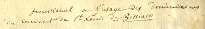
Nineteenth-century note that identifying the book as a, “processional a l’usage des dominicaines du couvert de St-Louis de Pissaico.” Poissy processional, Bryn Mawr College, front pages
Once they were folded, sewn, lined, and copied, the quires were stacked together in the correct order, bound inside covers that were usually made of wood, leather, cloth, or pasteboard, and trimmed to an equal size and shape. Our processional was rebound in the eighteenth century, so it would be difficult to reconstruct its original covers. Its edges were probably trimmed again slightly during the rebinding. Although the writing now does not always sit evenly on the page, the relative proportions of text and page suggest the book is fairly close to its original dimensions.[7] Additional front and back leaves were added after the Middle Ages, as well as marbled endpapers. In the nineteenth century, the book belonged to Jules Bonhomme, a musicologist and religious scholar, who was curé de Saint-Jean Baptiste de Grenelles, Paris and chaplain to the Fort de l’Est, Paris. Several of nineteenth-century notes are penciled at the front and back of the book.
[1] This essay addresses the basic structure and organization of the processional. For more technical details, see the Les Enluminures description.
[2] The manuscript certainly was still a luxury item. Rowan Watson estimates that in the fifteenth century a single sheet of parchment would have cost the same as one hundred sheets of fine linen paper. See, Watson, Illuminated Manuscripts and Their Makers (London: V & A Publications, 2003), 16. This cost is especially striking because the process of mechanical printing, popularized by Johannes Gutenberg in the mid-fifteenth century, was already revolutionizing the European book market by the time the manuscript was probably made. Indeed, by the 1490s, Dominican processionals were being printed in other parts of the continent. It seems likely that the aristocratic nuns of Poissy could have had prayerbooks printed, but they chose to continue producing manuscripts instead, perhaps because they preferred this more traditional and lavish format. See, Joan Naughton, Manuscripts from the Dominican Monastery of Saint-Louis de Poissy, Dissertation, The University of Melbourne. Melbourne: Minerva Access, 1995, 151-2
[3] Catchwords appear on ff. 12v, 20v, 28v, 36v, 44v, 64v, 72v, 79v, 87v, 95v, 103v, 111v, and 118v, suggesting that most of the quires contained eight folios, which was a standard size. (There is a stub before f. 79, although there is no apparent break in the text.) It is unclear why there are no catchwords in the middle of the manuscript.
[4] Lines in earlier manuscripts were more commonly scored with a hard tool or written in black. See Christopher de Hamel, The British Library Guide to Manuscript Illumination: History and Techniques (Toronto: University of Toronto, 2001), 47-8.
[5] The writing resembles the lettre bâtarde script, which was popular in the fourteenth and fifteenth centuries. For a description and comparisons, see Marc Drogin, Medieval Calligraphy: Its History and Technique (Montclair: Allanheld & Schram, 1980), 64-7.
[6] For a longer description of medieval punctuation, see Raymond Clemens and Timothy Graham Introduction to Manuscript Studies (Ithaca: Cornell University Press, 2007), 82-89.
[7] The height of the text was traditionally supposed to be about equal to the width of the page, and the margin at the bottom of the page was supposed to be about twice the width of the inner margin. See, de Hamel, Manuscript Illumination, 42-3.